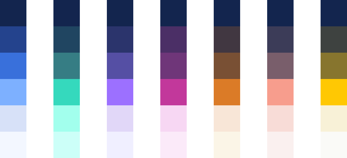
Colors

The Presonate color palette is designed to be distinctive, expressive, and flexible. Inspired by natural tones and dramatic contrasts, it balances rich, dark colors with brighter, more vibrant accents. Used consistently, the palette strengthens brand recognition, adds character to our communication, and helps maintain a unified visual identity across all touchpoints.

Primary Palette

The Primary Palette consists exclusively of blue-based tones and serves as the visual backbone of the Presonate brand. Its restrained, monochromatic character supports clear, professional, and distraction-free communication. This palette is designed to work in harmony with the more expressive product colors, providing a calm and consistent foundation across all brand applications.

Dark Night

HEX 0E1D3D

RGB 14 29 61

CMYK 90 78 24 53

Night

HEX 13254E

RGB 19 37 78

CMYK 100 90 41 38

Deep Ocean

HEX 23438D

RGB 35 67 141

CMYK 97 79 9 1

Blue Bird

HEX 3A70DB

RGB 58 112 219

CMYK 80 57 0 0

Seagull

HEX 5D7095

RGB 93 112 149

CMYK 69 52 23 7

Cornflower

HEX 7DB0FF

RGB 125 175 255

CMYK 52 25 0 0

Sky

HEX D7E1F8

RGB 215 225 248

CMYK 18 9 0 0

Light Sky

HEX F3F7FF

RGB 243 247 255

CMYK 6 2 0 0

Snow

HEX FFFFFF

RGB 255 255 255

CMYK 0 0 0 0

Product Colors

Product colors are used to distinguish Presonate’s different service areas and product-related content. Each color represents a specific discipline and helps create clarity, orientation, and consistency across interfaces, materials, and communications.

All product color palettes are built on a shared foundation: the darkest tone in every product palette is Night (#13254E). This ensures visual cohesion across products and seamless alignment with the core brand palette.

Product colors should be used purposefully and always in support of the core brand palette.

Preso Jungle

Preso Jungle represents the core of Presonate: presentation design. The color feels fresh, confident, and expressive, reflecting clarity of thought and strong visual storytelling. It is used to highlight presentation-related content and features.

Key Color

HEX 36D9BD

RGB 54 217 189

CMYK 63 0 38 0

Accents

HEX 1F4561

RGB 31 69 97

CMYK 93 70 40 27

HEX 367D84

RGB 54 125 132

CMYK 79 36 43 8

HEX A2FFED

RGB 162 255 237

CMYK 30 0 15 0

HEX CCFFF8

RGB 204 255 248

CMYK 16 0 7 0

Interactive Viola

Interactive Viola stands for interaction, flow, and user experience. Its vibrant yet controlled tone reflects responsiveness and digital precision, making it ideal for interaction design–related content and touchpoints.

Key Color

HEX C2389B

RGB 194 56 155

CMYK 31 85 0 0

Accents

HEX 4B2F66

RGB 75 47 102

CMYK 81 93 30 19

HEX 703678

RGB 112 54 120

CMYK 65 93 22 7

HEX F7D7F3

RGB 247 215 243

CMYK 2 18 0 0

HEX FBEAf9

RGB 251 234 249

CMYK 1 9 0 0

Graphic Grape

Graphic Grape expresses creativity, depth, and visual craftsmanship. The color supports graphic design content where composition, form, and visual detail take center stage.

Key Color

HEX 9C70FF

RGB 156 112 255

CMYK 60 60 0 0

Accents

HEX 2B346C

RGB 43 52 108

CMYK 97 91 28 16

HEX 554FA4

RGB 85 79 164

CMYK 78 80 0 0

HEX E1D7F8

RGB 225 215 248

CMYK 10 15 0 0

HEX F0EFFF

RGB 240 239 255

CMYK 4 4 0 0

PDF Apricot

PDF Apricot brings warmth and approachability to document-based content. It is used for publications, PDFs, and structured materials, adding clarity without overwhelming the layout.

Key Color

HEX DB7B27

RGB 219 123 39

CMYK 11 59 92 2

Accents

HEX 403741

RGB 64 55 65

CMYK 67 70 53 48

HEX 795035

RGB 121 80 53

CMYK 39 64 80 33

HEX F8E6D7

RGB 248 230 215

CMYK 2 9 13 0

HEX FBF5E7

RGB 251 245 231

CMYK 1 2 8 0

Motion Coral

Motion Coral captures energy, movement, and momentum. Its dynamic character makes it suitable for motion design, animation, and video-related content where visual impact is key.

Key Color

HEX F79D8D

RGB 247 157 141

CMYK 0 49 39 0

Accents

HEX 3c3c58

RGB 60 60 88

CMYK 80 76 41 32

HEX 795E6B

RGB 121 94 107

CMYK 52 63 43 17

HEX F8DCD7

RGB 248 220 215

CMYK 2 15 10 0

HEX FAF0EF

RGB 250 240 239

CMYK 1 5 3 0

Art Firefly

Art Firefly reflects imagination, detail, and character. The color supports illustration-driven content and expressive visual elements, adding personality while remaining cohesive with the broader system.

Key Color

HEX FFC800

RGB 255 200 0

CMYK 0 23 93 0

Accents

HEX 3E4240

RGB 62 66 64

CMYK 69 59 61 46

HEX 87752E

RGB 135 117 46

CMYK 44 44 100 18

HEX F8F1D7

RGB 248 241 215

CMYK 2 3 17 0

HEX FAFAF7

RGB 250 250 247

CMYK 1 1 2 0

Statuses & Alerts

Statuses & Alerts colors communicate system feedback and action states, ensuring clarity and consistency across interfaces. Use them purposefully and in support of the core brand palette.

Error

HEX d2274e

RGB 210 39 78

CMYK 12 98 64 1

HEX 4d1321

RGB 77 19 33

CMYK 44 88 66 63

HEX de6e83

RGB 222 110 131

CMYK 9 71 32 0

HEX edcdd2

RGB 237 205 210

CMYK 5 21 9 0

Success

HEX 27d293

RGB 39 210 147

CMYK 67 0 60 0

HEX 134a36

RGB 19 74 54

CMYK 87 44 79 46

HEX 6adcb2

RGB 106 220 178

CMYK 52 0 42 0

HEX d6f4e9

RGB 214 244 233

CMYK 15 0 11 0

Caution

HEX d27f27

RGB 210 127 39

CMYK 15 57 100 2

HEX 4e3113

RGB 78 49 19

CMYK 47 68 91 58

HEX d9a46b

RGB 217 164 107

CMYK 14 37 65 0

HEX fceedf

RGB 252 238 223

CMYK 1 6 11 0

In-progress

HEX e6bb1f

RGB 230 187 31

CMYK 11 25 100 0

HEX 4d4013

RGB 77 64 19

CMYK 55 58 100 51

HEX e4ca6d

RGB 228 202 109

CMYK 12 17 69 0

HEX fff9e2

RGB 255 249 226

CMYK 0 1 12 0

Color Pairings

Color pairings define how Presonate colors work together in practice. The combinations shown here are designed to support clarity, hierarchy, and consistency across different contexts. Use these pairings as a reference to ensure balanced compositions and a cohesive visual language.

Primary Palette

Night & Products

Product Schemes

Illustrations-Only

HEX 13254E

HEX 3A70DB

HEX 23438D

HEX 7DB0FF

HEX 3A70DB

HEX D7E1F8

HEX 7DB0FF

HEX F3F7FF

General Use

HEX 13254E

HEX 7DB0FF

HEX 23438D

HEX D7E1F8

HEX 3A70DB

HEX F3F7FF

HEX 13254E

HEX D7E1F8

HEX 23438D

HEX F3F7FF

HEX 13254E

HEX F3F7FF

Gradients

Gradients are derived from the Presonate color system and are used as supporting visual elements. They add depth, atmosphere, and emphasis without replacing solid color foundations. Gradients should be applied thoughtfully and sparingly, always in support of the primary color hierarchy and overall clarity of the layout.

Primary Palette

HEX 13254E

HEX 23438D

HEX 13254E

HEX 3A70DB

HEX 23438D

HEX 3A70DB

HEX 23438D

HEX 7DB0FF

HEX 7DB0FF

HEX D7E1F8

HEX D7E1F8

HEX F3F7FF

Products

Backgrounds

Shapes

Dark Mode Illustrations

Light Mode Illustrations

HEX 13254E

HEX 497B83

HEX 13254E

HEX 683975

HEX 13254E

HEX 544F9F

HEX 13254E

HEX 735239

HEX 13254E

HEX 755F6A

HEX 13254E

HEX 84763A

Contrast Ratio

Ensure optimal readability by entering a HEX code or using the color picker. This tool helps you choose the right text contrast when you're unsure which combination to use.

Always prioritize colors from our existing brand palette to maintain consistency.

HEX
RGB 125 176 255
CMYK 51 31 0 0
RECOMMENDED
FFFFFF
Aa

Color Hierarchy

Color hierarchy defines the roles of colors within the Presonate system. Primary colors lead and set the overall tone, product colors are used as accents for emphasis and differentiation, and neutral tones support balance and clarity.

Light and Dark Schemes

Light schemes are used for clear, guidance-focused, and informational content, where readability, clean presentation, and a well-organized structure are the primary goals, helping users quickly process and understand key information.

Product-focused Hierarchy

Preso Jungle

Presentations

Wow Your Audience
with Stunning Presentations

In product-focused contexts, such as service pages or feature highlights, the related product color may take on a more prominent role. In these cases, the product color is used to lead accents and emphasis, while the primary palette provides the underlying structure through its light or dark tones. This approach maintains hierarchy while allowing product differentiation.

Colors in Illustrations

Illustrations may use colors from the Primary Palette and the defined Product Color palettes. No additional color restrictions apply within these boundaries.

The selected colors should always support the overall color hierarchy and align with the intended context of the illustration.

Accessibility

Accessibility is a core consideration in the Presonate color system. Colors should always be used in ways that ensure sufficient contrast, legibility, and clarity across different contexts and devices. Designing with accessibility in mind helps make our communication more inclusive, usable, and effective for everyone.

AaBbCc

AaBbCc

Contrast & Legibility

Text and key visuals must maintain strong contrast. Readability always takes priority, especially in information-dense content.

Color as Information

Color should never convey information alone; always support it with text, icons, or labels.

Motion Design

Movement and Momentum

Learn More

Product Colors & Accessibility

Product colors are accents and must meet contrast standards; avoid highly saturated colors for text or critical info.

Light vs Dark Schemes

In light contexts, readability comes first; in dark contexts, stronger contrast and atmosphere are allowed if content stays clear.

Success

In-Progress

Caution

Error

Color Meaning Consistency

Colors used to express meaning must remain consistent across all products and surfaces.

You Rock!

Accessibility in Gradients & Overlays

When using gradients, images, or color overlays, ensure that key content maintains readable contrast across all parts of the surface.

Color Misuse

Color misuse occurs when colors are applied in ways that undermine clarity, hierarchy, or consistency. The examples below highlight common mistakes to avoid in order to maintain a clear and recognizable Presonate visual language.

Do not use the wrong color


Don’t use colors that are obviously not part of the Presonate color palette.

Do not eyedrop CMYK or RGB / HEX values

Small color shifts in RGB can cause headaches for developers. Using the wrong CMYK values can cause unexepected results in print.

RGB → Print

CMYK → Digital

Do not use the wrong color mode

Use RGB for screens and CMYK for print. Using the wrong color modes will cause serious consistency problems.

Do not use product colors as backgrounds

Do not use product key colors as full-background foundations. Product colors are accents and should not replace the primary palette.

AaBbCc

Do not combine multiple product colors

Avoid using multiple product colors within a single composition. This reduces clarity and weakens visual hierarchy.

Presentations

Do not swap product colors

Always use the product color that corresponds to the content or product being represented.

AaBbCc

AaBbCc

Do not use low contrast combinations

Avoid color combinations that result in insufficient contrast, especially for text and essential information.

Do not use low contrast combinations

Avoid color combinations that result in insufficient contrast, especially for text and essential information.

Do not conflict with functional semantics

Avoid using brand colors in a way that contradicts universal UI patterns. If a brand color is similar to a "success" green or an "error" red, do not use it for opposing actions.

Color Swatches

Download the official Presonate color swatches for design and development. Available formats ensure consistent implementation across digital and print environments.

Primary Palette

.ase .less .scss


Download asset

Product Colors

.ase .less .scss


Download asset

Legal

Privacy Policy

·

Copyright 2026 Presonate™