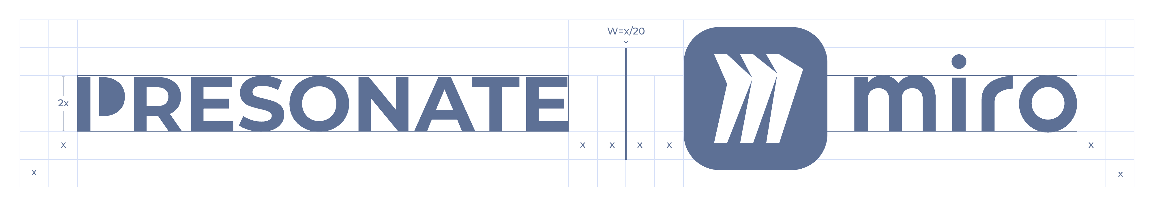
Logo

Our logo reflects the core principles of the Presonate brand: simplicity, effectiveness, and creativity. The wordmark is set in our signature typeface, Montserrat, and can be paired with the standalone “P” symbol. The symbol is built from simple geometric forms inspired by fundamental data visualization elements, referencing Presonate’s roots in presentation design while remaining timeless and versatile.

Variations

Approved logo variations are provided to ensure flexibility across different backgrounds and use cases. Only the variations shown here may be used. No other modifications, color changes, or custom adaptations of the logo are allowed.

Preferred Use Cases

Snow (White) on Night (Dark Blue)

Night (Dark Blue) on Snow (White)

Secondary Use Cases (Specific production or technical limitations)

Snow (White) on Black

Black on Snow (White)

Night (Dark Blue) on Light Sky (Light Blue)

Logo on Images

When placing the wordmark over an image, ensure it remains clear and easily recognizable. If the image is too complex, apply a subtle overlay or gradient behind the wordmark to improve visibility.

Clearspace & Sizes

To preserve clarity and visual impact, the logo must always be surrounded by sufficient clear space. This space ensures the logo remains legible and unobstructed in all applications.

Minimum Size

The minimum logo size defines the smallest scale at which the logo may be used while maintaining readability. Do not use the logo below the specified minimum size.

Digital

Minimum width: 120px

Recommended minimum: 140px

Print

Minimum width: 25mm

Recommended minimum: 30mm+

Logo in Use

This section shows how the Presonate logo is applied across common layouts and contexts. The examples focus on placement, scale, and visual hierarchy to help ensure the logo feels clear, balanced, and consistent in real-world use.

Placement

In horizontal layouts, the logo works best when placed in the upper-left corner. In vertical layouts, the upper-left corner is also preferred — or the logo may be centered when working with narrow formats.

Scale & Hierarchy

The logo should support the layout, not dominate it. Keep its size proportional to the overall composition and ensure it sits clearly within the visual hierarchy.

Background Selection

Place the logo on calm, uncluttered backgrounds to maintain clarity and contrast. When using imagery, ensure sufficient separation between the logo and surrounding details.

Logo vs. Symbol

Use the full logo when space allows and brand recognition is key. Switch to the symbol in small or constrained formats where the wordmark would lose legibility.

Contextual Examples

These examples show how the logo adapts across common layouts while maintaining clarity, balance, and consistency.

Co-Branding

In brand partnerships, the primary logo is used alongside partner logos. To ensure clarity and visual balance, all logos should be treated with equal weight and aligned within a clear, consistent hierarchy. Follow the guidelines below to achieve proper alignment, scaling, and visual unity across co-branded applications.

Logos should be separated by the height of the Presonate Symbol. A thin vertical rule (of 2px) should be used to clearly differentiate logos.

Dos and Don'ts

To maintain a consistent and recognizable brand, always use the logo as defined in these guidelines. Avoid altering, recreating, or combining the logo in any way not explicitly approved. When in doubt, use the primary logo or consult the Brand team.

DOS

Use the primary logo as the default choice across brand communications.

Select logo versions based on contrast and legibility, not personal preference.

Switch to the symbol when the logo needs to appear at very small sizes.

Place the logo on calm, uncluttered backgrounds whenever possible.

RISING TOGETHER

2025

Maintain clear visual hierarchy between the logo and other elements.

Treat the logo as a graphic signature, not a decorative element.

DON'TS

Do not alter the form or proportions of the logo.

Do not stretch, compress, rotate or distort the logo.

Do not change the letterspacing of the wordmark.

Do not use the "P" symbol together with the wordmark.

Do not outline the logo.

Do not use the wordmark as part of a sentence or body text.

Do not add gradients, shadows, or other effects to the logo.

Do not crop, mask, or partially hide the logo.

Do not use logo versions outside the approved variations.

Do not place the logo on unapproved background colors or low-contrast surfaces.

Do not change the opacity or transparency of the logo.

Do not place the logo over busy imagery that reduces legibility.

More in Assets Library

If you have access, you can explore the full collection there and download any assets you need.

Explore more

Legal

Privacy Policy

·

Copyright 2026 Presonate™