Symbol

The Presonate symbol is a distilled representation of the brand — simple, bold, and highly recognisable.

 Built around the letter “P”, the symbol combines geometric clarity with visual character, making it suitable for compact formats where the full logo is not practical.

Primary Symbol

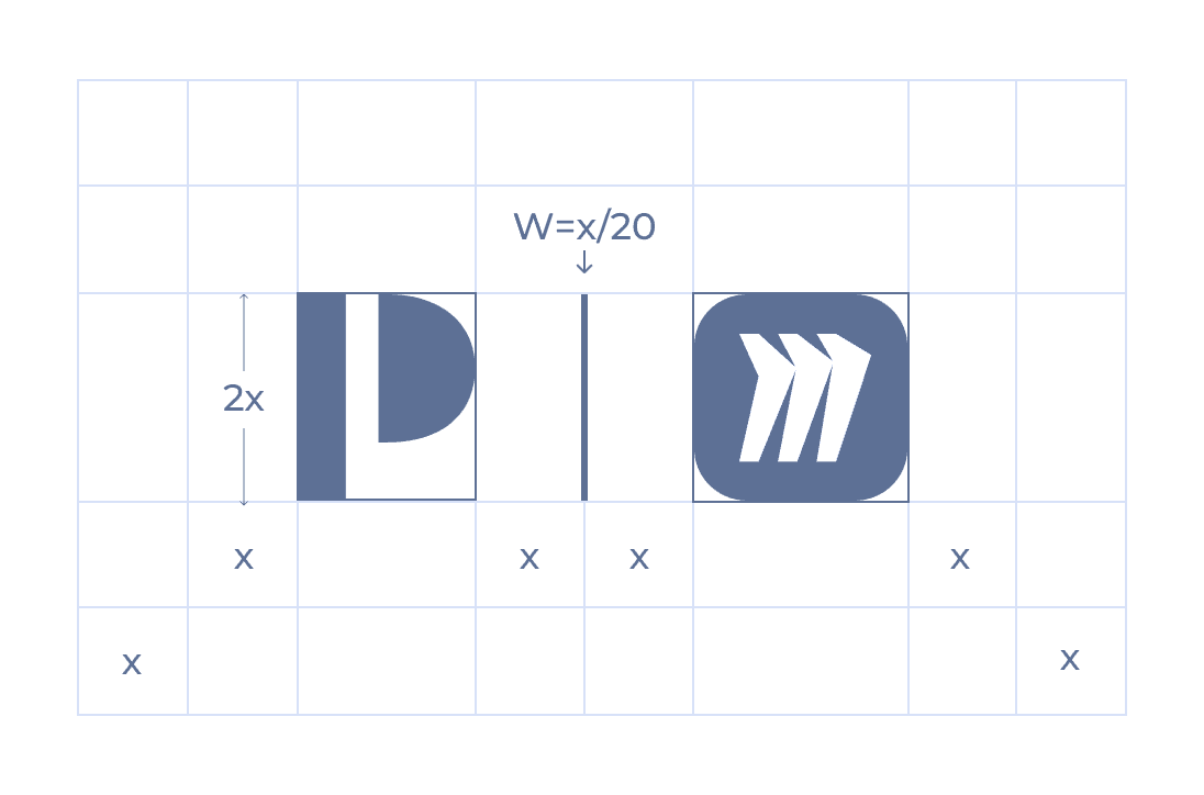
The primary symbol is the standalone “P” mark and serves as the core visual shorthand of the Presonate brand. It should be used in situations where space is limited or when a more minimal brand presence is required, such as app icons, favicons, avatars, or UI elements.

When used on its own, the symbol is aligned based on its bounding box and should not be optically adjusted or manually repositioned. Always use the approved symbol artwork without modification.

Containers

In compact and UI-driven applications, the Presonate symbol may be placed inside a container. Approved container shapes include a square, a rounded square, and a circle.

When used inside a container, the symbol is optically centered rather than mathematically centered. Due to the asymmetrical visual weight of the symbol, a subtle horizontal offset is applied to achieve visual balance. The amount of optical offset depends on the container geometry and is applied consistently to ensure a stable and balanced appearance across sizes and formats.

Square

Radius = 0%

Rounded Square

Radius = 25%

Circle

Radius = 50%

Clearspace & Sizes

To preserve clarity and visual impact, the symbol must always be surrounded by sufficient clear space. This space ensures the symbol remains legible and unobstructed in all applications.

Minimum Size

The minimum symbol size defines the smallest scale at which the symbol may be used while maintaining readability. Do not use the symbol below the specified minimum size.

Digital

Minimum width: 16px

Recommended minimum: 24px

Print

Minimum width: 6mm

Recommended minimum: 10mm+

Symbol in Use

This section shows how the Presonate symbol is applied across common layouts and contexts. The examples focus on placement, scale, and visual hierarchy to help ensure the logo feels clear, balanced, and consistent in real-world use.

Placement

In horizontal layouts, the symbol works best when placed in the upper-right corner. In vertical layouts, the upper-left corner is also preferred — or the symbol may be centered when working with narrow formats.

Scale & Hierarchy

The symbol should support the layout, not dominate it. Keep its size proportional to the overall composition and ensure it sits clearly within the visual hierarchy.

Background Selection

Place the symbol on calm, uncluttered backgrounds to maintain clarity and contrast. When using imagery, ensure sufficient separation between the symbol and surrounding details.

Logo vs. Symbol

Use the full logo when space allows and brand recognition is key. Switch to the symbol in small or constrained formats where the wordmark would lose legibility.

Contextual Examples

These examples show how the symbol adapts across common layouts while maintaining clarity, balance, and consistency.

Co-Branding

As a general rule, the Presonate symbol is not used in co-branded applications. In exceptional cases, the symbol may be used when partnering with brands that are primarily represented by a symbol rather than a wordmark. Such use requires prior approval to ensure visual balance, clarity, and brand recognition.

Favicon

For icons, we use the P symbol. Logo itself should not be used here, as the legibility of that text will be compromised at such small scale. The same icon is usable in both light/dark modes.

Dos and Don'ts

To maintain a consistent and recognizable brand, always use the symbol as defined in these guidelines. Avoid altering, recreating, or combining the logo in any way not explicitly approved.

DOS

Use the symbol in compact or space-limited contexts.

Select symbol versions based on contrast and legibility, not personal preference.

Use approved containers only. (Square, rounded square, circle)

Apply optical centering when using containers.

Place the symbol on calm, uncluttered backgrounds whenever possible.

In presentations, place the symbol in the top-right corner of content slides.

DON'TS

Do not alter the form or proportions of the symbol.

Do not stretch, compress, rotate, flip, or distort the symbol.

Do not change the spacing between the symbol's shapes.

Do not use the symbol together with the wordmark.

Do not use the "P" symbol to replace a letterform.

Do not place the symbol inside unapproved shapes.

Do not add gradients, outlines, shadows, or other effects to the symbol.

Do not crop, mask, or partially hide the symbol.

Do not use symbol versions outside the approved variations.

Do not place the symbol on unapproved background colors or low-contrast surfaces.

Do not change the opacity or transparency of the symbol.

Do not place the symbol over busy imagery that reduces legibility.

More in Assets Library

If you have access, you can explore the full collection there and download any assets you need.

Explore more

Legal

Privacy Policy

·

Copyright 2026 Presonate™